If you’re running a business, you know that color is important. It might be one of the most important factors in your branding and marketing strategy. But what do you know about color theory? And how can you use that knowledge to create better product and service designs? In this post, we’ll explore some advanced concepts in color theory and show you how to put them into practice. So read on to learn more!
What is Advanced Color Theory?
Advanced color theory studies color beyond the basic concepts of hue, value, and chroma. It delves into the relationships between colors, how they interact, and how they can be used to create specific effects.
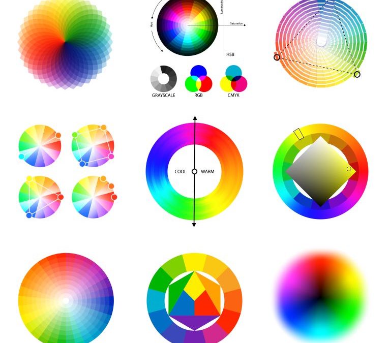
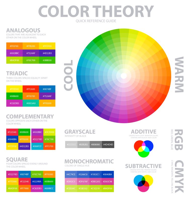
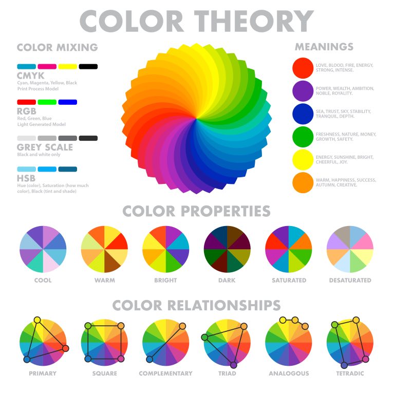
Color theory is an important tool for artists, designers, and anyone who works with color. A strong understanding of color theory can help you to create harmonious color schemes, choose the right colors for your projects, and avoid color mistakes. A color wheel is a helpful tool for understanding color theory. Primary colors are the basic colors that can’t be created by mixing other colors. They are located on the outer edge of the color wheel and are used to create all other colors. The three primary colors are red, yellow, and blue.
Secondary colors are created by mixing two primary colors. They are located between the primary colors on the color wheel and include orange, green, and purple.
Tertiary colors are created by mixing a primary color with a secondary color. They are located between the primary and secondary colors on the color wheel and include yellow-orange, red-orange, red-purple, blue-purple, blue-green, and yellow-green.
The color wheel can be divided into warm colors and cool colors. Warm colors are located on the inner half of the wheel (red, orange, yellow) and are used to create a warm, vibrant, or passionate effect. Cool colors are located on the outer half of the wheel (blue, green, purple) and are used to create a cool, relaxing, or subdued effect.
Color schemes are created by using colors next to each other on the color wheel. There are four main types of color schemes: monochromatic, complementary, split-complementary, and analogous.
What are the Different Color Models?
There are a variety of color models that artists and graphic designers use to create their work.
The RGB Color Model
The RGB color model is an additive in which red, green, and blue light are combined in various ways to reproduce a broad array of colors. The name of the model comes from the initials of the three primary colors, red, green, and blue. The color combinations that an RGB color model can produce are often represented as a three-dimensional graph with red, green, and blue as the axes. For example, the yellow green point on the graph can be produced by adding red and green light. As the visible light spectrum is continuous, so is the RGB color model. Usually, colors are represented as hexadecimal triplets. For example, the yellow green color can be written as “00FF00”. Similarly, the RGB color model is also sometimes represented by a four-character hexadecimal code. For example, the yellow green color can be written as “0x00FF00”.
The CMYK Color Model
The CMYK color model (also known as process color or four colors) is a subtractive color model used in color printing and is also used to describe the printing process itself. CMYK refers to the four inks used in some color printing: cyan, magenta, yellow, and key (black).
These four inks are combined in different ways to produce all the colors in the visible spectrum. Theoretically, any color can be created using the right combination of cyan, magenta, yellow, and black. In practice, however, some colors are more difficult to create than others, and certain color combinations may produce undesirable results.
To successfully print a color image, the four CMYK inks must be accurately applied to the paper in the correct proportions. If even one of the inks is not applied correctly, the final image will be flawed. The CMYK color model is not used for displaying images on a computer screen because it is a subtractive color model. The RGB color model, an additive color model, is used instead.
The HSL and HSV Color Models
The HSL (pure hue, saturation, lightness) and HSV (hue, saturation, value) color models are two ways of representing color that can be useful for certain applications. HSL is based on a cylindrical representation of colors, where the angle around the central axis defines the hue. The other two dimensions are saturation and lightness, varying from the center to the cylinder’s edge.
The analogous color scheme is often used with HSL because it is more intuitive than HSV. HSV is based on a cone-like representation of colors, where the angle around the central axis defines the hue, and the other two dimensions are saturation and value, which vary from the apex to the base of the cone. Just like the Additive color model, the value in HSV represents the brightness of the color. If you imagine the HSV cone as a slice of cake, then the value is how much frosting is on each piece.
HSL and HSV are both very useful models for representing color. HSL is more intuitive because it is based on a cylindrical representation of colors. It is also more versatile because it can be used with any color system, not just the Additive color model. HSV is more useful for applications where the brightness of the color is more important than the other two dimensions.
Do you want to use advanced color theory to your advantage?
The Pantone Color Matching System
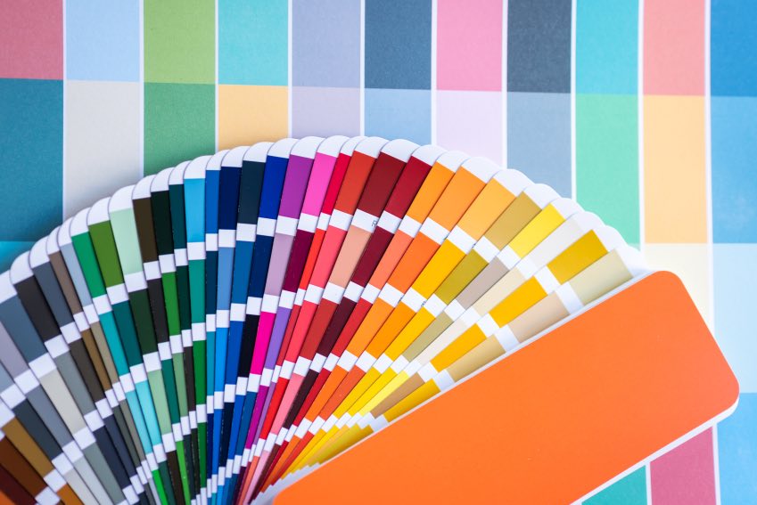
The Pantone color matching system is a standardized color reproduction system. Pantone colors are identified by a code that refers to the specific mixture of inks needed to produce that color. The Pantone system is used in various industries, from printing to fashion, and is the standard by which colors are matched in the graphic design industry.
Pantone colors are identified by a code that refers to the specific mixture of inks needed to produce that color. For example, the code for “bright red” is Pantone 185 C. The “C” at the end of the code indicates that the color is part of the Pantone Coated collection, which is used for printing on coated paper.
The Pantone color matching system is a great tool for designers who must accurately communicate color. It’s also helpful to ensure that colors match between different devices and print processes. And as the colored light on your monitor reflects off the white page, the colors you see in this article are a close representation of the actual Pantone colors.
Lab Color Model
The Lab color model is a color space that attempts to represent all visible colors using three dimensions. The Lab color model is often used in graphic design and photography because it is device independent and can be accurately reproduced on any device.
The three dimensions of the Lab color model are lightness (L), chroma (C), and hue (h). The lightness dimension represents the amount of light reflected off a surface. The chroma dimension represents the amount of color reflected off a surface. The hue dimension represents the wavelength of the light reflected off a surface.
The Lab color model is a great tool for color correction because it allows you to make very precise adjustments to the color of an image. However, the Lab color model is also very complex and can be difficult to understand. If you are not familiar with the Lab color model, it is recommended that you seek out a tutorial or course that will teach you the basics. Unlike the RGB and CMYK color models, the Lab color model is not widely used in everyday life. However, it is a very important tool for those who work in the graphic design and photography industries.
The three dimensions of the Lab color model are:
Lightness (L)
The lightness dimension represents the amount of light reflected off a surface. The lightness of a color is measured on a scale from 0 to 100. A color with a lightness value of 0 is black and a color with a lightness value of 100 is white.
Chroma (C)
The chroma dimension represents the amount of color reflected off a surface. Chroma is measured on a scale from 0 to 100. A color with a chroma value of 0 is a grayscale color and a color with a chroma value of 100 is a pure, saturated color.
Hue (h)
The hue dimension represents the wavelength of the light reflected off a surface. Hue is measured on a scale from 0 to 360. The hue of a color can be thought of as its “color temperature.” If a color has a hue of 0, it is red. If a color has a hue of 120, it is green. If a color has a hue of 240, it is blue.
What are the Benefits of Using Advanced Color Theory in a Business?
There are many benefits to using advanced color theory in business. Here are just a few:
Create a unique color palette for your brand
Advanced color theory can help you create a unique color palette for your brand. This can help you stand out from your competitors and make a lasting impression on your customers. As every color has different connotations, it is important to choose the right colors for your brand in order to send the correct message. The yellow orange of McDonald’s represents happiness and energy, while blue is often seen as trustworthy. Similarly, Coca Cola’s red is associated with excitement.
When creating a color palette for your brand, you should consider the following:
- The message you want to send
- Your target audience
- The emotions you want to evoke
- The colors that are associated with your brand
- Your brand’s values
Once you have considered all of these factors, you can start to create a color palette that is unique to your brand.
Appeal to a wider audience
You can appeal to a wider audience by using an advanced color theory. Different colors have different associations; therefore, some colors will resonate more with certain demographics than others. For example, pink is often associated with femininity, so it would be a good choice for a brand aimed at women. At the same time, green is often seen as a calming color and can be used to appeal to those who are looking for a more natural or eco-friendly option. According to many studies, color is one of the most important factors in choosing a product. So, by understanding advanced color theory, you can ensure that your products are more likely to be successful. Every time you see a color, you make a split-second judgment about that thing, and that can be the difference between someone buying your product or not.
Enhance the mood of your space
The colors you use in your business can have a big impact on the mood of your space. Using oranges, reds, and yellows can be a good choice if you want to create a feeling of warmth and welcome. If you want to create a feeling of calm and serenity, then using blues and greens can be a good option. Different types of warm colors can also create different moods. For example, a bright red can be seen as exciting and energetic, whereas a deep burgundy can be seen as more sophisticated and luxurious. As every space is different, it’s important to experiment with different colors to see what creates the desired mood in your business. Even if you’re not planning on changing the colors in your space, understanding how color can impact mood can help choose products and marketing materials.
Communicate your brand identity more effectively
Your brand identity is more than just your logo, and it’s the overall look and feel of your business. Using a consistent color scheme across all your branding can help communicate your brand identity more effectively. If you want to create a fun and friendly brand identity, then using light and bright colors can be a good choice. Whereas if you want to communicate more serious and professional brand identity, then using darker and richer colors can be a better option.
An effective brand identity should be based on a deep understanding of your target audience, business goals, and company values. Once you have a strong foundation, you can start to develop creative elements like your logo, color palette, and typography.
Make your marketing and advertising materials more impactful
Advanced color theory helps in making your marketing and advertising materials more impactful. It can guide your color choices to create the most visually appealing and attention-grabbing displays.
Many businesses don’t put enough thought into their color schemes and end up with a mishmash of colors that don’t work well together. This can be avoided by understanding the basics of color theory and using it to create a cohesive color scheme for your brand.
Advanced color theory can also help you create an overall look and feel for your business that is in line with your brand identity. This includes choosing colors for your website, business cards, stationery, flyers, and other marketing materials.
Stand out from your competitors
In today’s competitive business landscape, it’s important to stand out from your competitors. One way to do this is to create a unique and recognizable color scheme for your brand. This can be achieved by using a limited color palette and sticking to it across all your branding and marketing materials.
A well-thought-out color scheme can greatly impact your brand’s visibility and recognition. It can also convey certain messages and emotions that you want to associate with your brand.
Choosing the right colors for your brand is not always easy. There are a lot of factors to consider, such as the type of business you’re in, your target audience, and the overall tone you want to set for your brand.
Make your website more visually appealing
Your website is often the first contact between your business and potential customers. Making sure it’s visually appealing is essential to keeping visitors engaged.
One way to make your website more visually appealing is to use a color scheme that compliments your brand identity. This can be achieved by understanding the basics of color theory and using it to create a cohesive color scheme for your website.
Another way to make your website more visually appealing is to use high-quality images and videos. This will help capture visitors’ attention and keep them engaged with your content.
Use advanced color theory to boost your marketing strategy now!
Increase customer engagement and loyalty
Color can be used to increase customer engagement and loyalty. This can be achieved using a consistent color scheme across all your branding and marketing materials. A well-thought-out color scheme can greatly impact your brand’s visibility and recognition. It can also convey certain messages and emotions that you want to associate with your brand. Every well-established brand has a unique and recognizable color scheme.
Some businesses use color psychology to influence customer behavior. For example, many supermarkets use blue in their branding as it is known to promote feelings of trust and security. This can encourage customers to spend more time in the store and ultimately buy more products.
There are many other benefits to using advanced color theory in business. These are just a few of the most notable. If you want to create a strong and recognizable brand, then the advanced color theory is an essential tool you need to understand.
Final Words on Advanced Color Theory
Advanced color theory is a powerful tool that can be used to improve the look of your branding and marketing materials. Where you run social media campaigns, typography ads, video content, email blasts, handing out flyers or brochures, you need to use color psychology and theory. It can also help you create an overall look and feel for your business that is in line with your brand identity. If you’re unsure where to start, plenty of resources are available online to help you get started. And if you need some help, plenty of professional designers who can assist you in creating a cohesive color scheme for your brand.
Advanced color theory is not just for businesses. Individuals can also use it to make their projects more visually appealing. So whether you’re working on a website, presentation, or just trying to add a little more color to your life, understanding the basics of color theory is a great place to start. Thanks for reading!
Growth Hackers is an award-winning digital marketing and growth hacking agency helping businesses from all over the world grow. There is no fluff with Growth Hackers. We help entrepreneurs and business owners use advanced color theory to improve their marketing designs, generate qualified leads, optimize their conversion rate, gather and analyze data analytics, acquire and retain users and increase sales. We go further than brand awareness and exposure. We make sure that the strategies we implement move the needle so your business grow, strive and succeed. If you too want your business to reach new heights, contact Growth Hackers today so we can discuss about your brand and create a custom growth plan for you. You’re just one click away to skyrocket your business.





1 Comment
Very useful information here. Color theory and psychology are so important in branding and I’m surprised to see that many people neglecting it.