What makes a great website? Fast loading speed, clean layout, stunning visuals, seamless navigation – indeed, all these things contribute to a great website.
But one underrated factor that web designers tend to overlook is the site’s color scheme. Your color scheme is more than just an aesthetic choice – it’s a tool that can help reinforce your branding and help deliver your message.
As there are a total of 16,777,216 color combinations possible (yes, it’s a lot!), we’ll give you a quick rundown on how to choose the best one for your website.
Let’s get started.
Why Are Your Website’s Color Scheme Important?
Before we go into choosing your color scheme, let’s first explore why it’s important to choose the right one to begin with.
Some key reasons are:
1. Reinforces your brand identity
Color plays a huge role in a person’s perception of a brand.
This is because certain colors are associated with a trait, personality, or theme. Notice how we associate eco-friendliness with green? Or a fiery bold personality with red? Or that we find the color blue calming, while we see orange as playful and energetic?
The same logic will apply to your brand. Want your business to be seen as cheerful and bright? Then go for yellow or orange. Want to look feminine and charming? Then go for pink. How about chic and sophisticated? Then a simple black and white color scheme will work for you.
By using a color scheme that adheres to your brand identity on your website, you can subtly reinforce your identity in your audience’s minds.
2. Builds brand recognition
Having a set color for your brand is only half of the battle. Now, you will need to use them repeatedly to build recognition in your audience.
The reason is that it takes people 5 to 7 impressions before they even remember a brand. So if you already have a color scheme, you’ll need to use it in all your marketing materials – from your business cards, social media profiles, email marketing, and yes, your website.
The more people see your branding and color scheme, the easier it will be for them to remember you.
Think of the Coca-Cola red and white or the IKEA blue and yellow. You can identify them from miles away, right? That’s the power of a recognizable color scheme.
Of course, branding is not limited to just your color scheme. Make sure to add your branding assets all over – always display your logo, use your set typography, use images that adhere to your brand style, and use a distinct and branded domain name.
3. Creates visual harmony
A cohesive and complementary color scheme helps in the visual harmony of your website.
Too much clashing colors can be too harsh and distracting. It can lead to people clicking away from your site since it’s too much for their eyes to take. It can also make your text difficult to read, or your other visual elements get drowned out.
On the other hand, a too muted palette can be too boring and too dull. Ever seen some sites that are just too plain? As they don’t visually stand out, you’ll easily forget their brand and website.
Striking the right balance is key. This is even more crucial as it was found that 38% of users won’t engage with a website if they find it unappealing. It needs to look beautiful enough while still visually comfortable to look at so your audience will feel at ease while exploring your site.
4. Helps with user experience
A great color scheme helps with the navigability of your website. It also improves user experience, which leads to higher customer satisfaction.
As mentioned above, a harmonious color scheme makes text, links, buttons, and images easier to see. That’s much more appealing for users since they won’t have a difficult time finding what they need on your website.
Consistent use of colors for your site can also make navigation more intuitive and seamless. For example, each “Next” button on a website are the ones that are colored red. Some when you see a red button, you’ll immediately know what it does.
Colors can also be used to highlight important elements on your site. An important CTA button, for instance, can be placed on a plain white background to draw attention to it. This can help boost your conversion rates.
Ready to unlock the secrets to an eye-catching website with the right color scheme?
Contact Growth Hackers
X Best Practices on Choosing Your Website’s Color Scheme
Let’s now move on to the things you should keep in mind when choosing your color scheme. These are:
1. Know your Brand Identity
The first step is to know your brand identity.
What do you want your brand to be known for? How do you want to be perceived? Do you want to be seen as friendly and approachable? Artistic and bold? Cute and charming? Luxurious and elegant? And so on.
Knowing your brand identity can guide you in choosing the right color to represent your brand.
2. Know your Audience
The right color scheme is one that your target audience will find appealing.
For example, trendy Gen-Z’s will probably appreciate a punchier, more vibrant color scheme. Meanwhile, middle-aged professionals will probably prefer a simpler and cleaner color combo.
Make sure to research your audience’s demographics and psychographics to come up with a color that they will like.
3. Follow the 60-30-10 Rule
60-30-10 is actually a popular interior design rule that can be applied to your web design as well.
It means that:
- 60% is your dominant color, in this case is your website’s background color
- 30% is your secondary color, one that will complement or contrast your background
- 10% is your accent color, one that is eye-catching and will pop from the background. This is used to draw attention to important buttons and information.
Your background color is the one that takes up most space in your website. Most websites choose white, off-white, or cream since they provide the most contrast and readability.
An example is the McDonald’s website. They use 60% white, 30% yellow, and 10% red. This gives a more pleasant looking site compared to if they used yellow on the background, as this might be overly bright for people’s eyes.
This doesn’t mean that you can’t use your branding colors as your dominant color ever. Just use a softer and more muted version of it to make it more relaxing to the eyes. For example, use a pale red instead of bright crimson for your background.
Accent colors are usually thought of as a bright distinct color. These may be true for websites with predominantly neutral background color. But if your website is already colorful, you can use simpler colors like white for your accent instead.
Following this 60-30-10 rule can give you a balanced look that won’t be overwhelming for your audience. This should also give you an idea on what colors will work best for you.
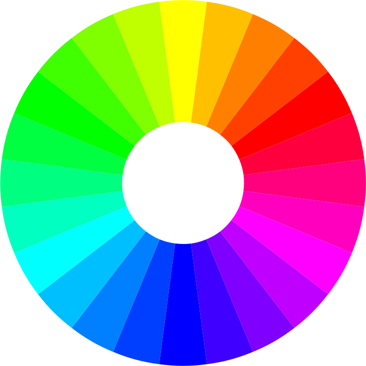
4. Understand the Color Wheel
Knowing the basics of the color wheel can also guide you in choosing the right colors. This is because your color scheme can be easily found on the color wheel.
Some popular color harmonies are:
- Monochromatic – using different colors found in one hue. For example, a light yellow – yellow – dark yellow combination is a monochromatic one.
- Complementary – these are the colors found in the opposite ends of the color wheel. This can be blue and red or yellow and purple.
- Analogous – these are the colors that are near each other on the color wheel. These can be blue and purple, or red and orange.
You don’t need to be limited with this however for your color palette. But if you’re stuck on coming up with colors, you can refer to the color wheel for inspiration.
Enhance your brand’s appeal with the perfect website color scheme!
5. Use Online Tools
There are apps and software that you can use to generate color schemes for you. Some examples are Coolors, ColorHunt, ColorSafe, Khroma, and Palettr. These tools can help you easily visualize how these colors will work together.
You can also visit websites to find more inspiration. Check out designs on Pinterest, Dribbble, Behance, Site Inspire, and Awwwards.
6. Test How it Looks
Lastly, do a run through of your website after applying your color scheme. You may find that it looks good in theory but it looks different in real life.
You can also check if your text still looks legible, or if an image gets washed out when placed near your accent secondary color.
Make sure to also check your website using different devices and browsers. This helps you catch any errors or issues before your audience can even encounter them.
7. Look at Trends
While we don’t recommend blindly following trends (as it can make your web design look dated after some time), there is still some merit with looking at what’s popular to see if you can tastefully incorporate some of them into your site.
For example, the Pantone Color of the Year. Since it’s everywhere, including them in small doses can make your site look trendier, hip, and more appealing to your audience.
Another is the resurgence of Y2K. If you have a more artistic and experimental brand identity, dipping your toes to the bubblegum pinks and lime green of Y2K is not a bad idea for your website.
Dark mode is also becoming more prevalent in websites and apps. You can consider using a darker color palette using black, dark gray, or navy to suit your audience that may prefer dark mode.
Wrapping Up on How to Pick your Website’s Color Scheme
Color plays a bigger part in the success of your web design than you may initially think. Aside from making your website more visually appealing, it can also help reinforce your branding, deliver your message, as well as help create a more seamless user experience.
But do take note that your website won’t end with just a beautiful visual design. Don’t forget to pay attention to your content, UI/UX, loading speed, down to the security of your website.
All of these factors will help in building a great website that your audience will want to visit over and over again.
Growth Hackers is a forward-thinking startup branding agency helping businesses from all over the world grow. There is no fluff with Growth Hackers. We help entrepreneurs and business owners transform their website’s impact with the perfect color scheme, generate qualified leads, optimize their conversion rate, gather and analyze data analytics, acquire and retain users and increase sales. We go further than brand awareness and exposure. We make sure that the strategies we implement move the needle so your business grow, strive and succeed. If you too want your business to reach new heights, contact Growth Hackers today so we can discuss about your brand and create a custom growth plan for you. You’re just one click away to skyrocket your business.


