Trying to design a high-converting landing page? Looking for effective tips on landing page design which are still relevant? Look no further, as in this detailed guide you will discover the top 12 tips for effective landing page design this year.
Landing page design is both an art and science. Creating a high-converting page requires time, patience, skill, knowledge and even talent to a degree. Trying to build one from scratch without any beforehand experience or knowledge of basic principles of copywriting and design is definitely a bad idea. In such a case, you must either hire an experienced team of developers, or learn everything yourself.
Before one attempts to build his or her first landing page, he or she must learn the fundamental principles of this discipline and know a few important tips. This endeavor combines knowledge and skills from a few different fields: marketing, consumer psychology, copywriting, web design (web development issues you can bump into and you need to make sure you know how to avoid them), color theory, and many others. There are many .
Also, the principles and trends in landing page design constantly shift. Some things which were popular back in the early 2000s definitely would not work today. We mean, just look at Salesforce’s landing page in 1999:
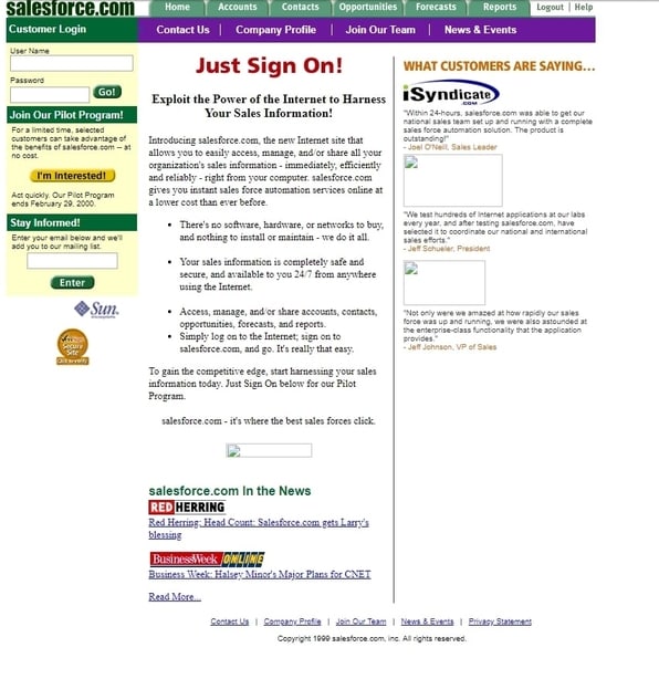
Undoubtedly, the science of landing page design is constantly moving forward and changing. Therefore, many of our readers would like to learn how to make high-converting landing pages this year. They're wondering which attributes describe a good landing page experience. For this reason, we have created this comprehensive guide which lists the top 12 tips for building effective landing pages in this year:
● Understand Your Audience
● Decide on the Desired Action
● Create a Great Unique Selling Proposition
● The Headline Is the King
● Subheadlines Matter As Well
● Use Bullets
● Make Your Page Long
● Add Social Proof
● Use the Right Color Scheme
● Add Urgency
● Add Scarcity
● Add Security Elements
So, with this being said, let’s head on straight to our first tip which is…
#1 Understand Your Audience
Before you do anything else, you must have a crystal-clear understanding of who your target audience is. This is the core of successful landing page design and successful marketing in general. If you want to create successful landing pages, high-converting sales funnels, run marketing campaigns or grow your business, start by understanding your audience.
The better you know your customers, the better you can serve them and make them buy from you. You must understand their needs and wants, their emotions: fears, hopes, dreams and many other aspects of their psychology. If you do not know exactly who belongs to your target audience then the first thing you must do is to create a customer avatar. Based on this profile, you will be able to proceed with the design of your page.
The better you know your customers, the better you can serve them and make them buy from you. You must understand their needs and wants, their emotions: fears, hopes, dreams and many other aspects of their psychology. If you do not know exactly who belongs to your target audience then the first thing you must do is to create a customer avatar. Based on this profile, you will be able to proceed with the design of your page.

#2 Decide on the Desired Action
Once you know who your target audience is, you must determine what specific action you want them to take. Bear in mind, you must have only one clear desired action, only one call-to-action (CTA), not two or more. You want to focus your reader’s attention on one thing a time, you want to control his or her attention. Having more than one CTA will distract them.
What that desired action is will impact the entire landing page design. Having powerful CTAs is one of these proven web design tips that will help you fuel your business growth. If you want your readers to sign up for a free newsletter, you’re gonna have a totally different page structure then if you wanted them to purchase something from you.
What that desired action is will impact the entire landing page design. Having powerful CTAs is one of these proven web design tips that will help you fuel your business growth. If you want your readers to sign up for a free newsletter, you’re gonna have a totally different page structure then if you wanted them to purchase something from you.
#3 Create a Great USP
“What is a USP?”, you might ask. USP stands for a unique selling proposition. This is your value proposition to the target audience. You have to clearly answer a reader’s question “what’s in there for me?”. USP provides that answer. Your USP is one of those landing pages' key components that you shouldn't neglect.
Now, how does one create an effective USP? In your proposition, you state clearly what you are going to deliver (for instance, Domino’s Pizza’s “fresh hot pizza”, you add specific details (for example, “delivered under 30 minutes”) and a guarantee. Domino’s Pizza’s famous USP was: “Fresh hot pizza delivered in 30 minutes or less, guaranteed.”
This simple USP made this company a lot of money. Similarly, before beginning to write copy and designing your page you must take your time to craft a really catchy and persuasive USP for your target audience.
#4 The Headline Is the King
If you run email marketing campaigns, you know that headline/subject lines are important. For landing pages, the concept is the same. So, why are headlines so important? The reason is simple - a headline determines whether your reader will devote his or her time to read your text. If your headline is not attention-grabbing, and persuasive enough to make them read the entire text, then it does not matter how great the rest of the landing page is. You’ve already lost. Therefore, it is vital that you create the best possible headline you can as the success of your landing page depends on it to a large extent.
#5 Subheadlines Matter As Well
You don’t want your page to have just one headline. You want to have enough headlines for every couple of paragraphs where it’s appropriate. This makes it easier for readers to navigate, perceive your content and raises their interest.
#6 Use Bullets
Using bullet points is a great way to optimize your landing page for conversions. Let’s be honest, we all love bullets. Google loves them as well. They are an effective attention-grabbing tool which makes it easier to structure and present information to your readers. They can be used to list the key advantages of your product/service, etc. Therefore, always use bullets wherever you can.
#7 Make Your Page Long
“The more you tell, the more you sell”, says the old copywriting proverb. And it’s still relevant this year. While some readers might argue that short landing pages may be effective as well, we will say that you have nothing to lose if you make your landing page long. More length definitely won’t hurt your conversion while insufficient length might actually decrease it.
Your readers always want to know more so it’s your job to provide them with as much information as possible However, it is important to note that length matters only as long as the content is relevant and informative. It does not matter how long the copy is if it does not bring any value to the reader. Therefore, always combine length with value.
Your readers always want to know more so it’s your job to provide them with as much information as possible However, it is important to note that length matters only as long as the content is relevant and informative. It does not matter how long the copy is if it does not bring any value to the reader. Therefore, always combine length with value.
#8 Add Social Proof
Humans are social beings. We are genetically programmed to follow the behavior of our herd. This phenomenon is effectively exploited by smart marketers who use social proof in their materials.
The best social proof elements are testimonials from happy customers, press materials about your company or product on famous media channels, famous companies/individuals who use your products, high brand popularity, and awareness. Therefore, take your time to think which social proof triggers you can add to your landing page to increase your conversions.
The best social proof elements are testimonials from happy customers, press materials about your company or product on famous media channels, famous companies/individuals who use your products, high brand popularity, and awareness. Therefore, take your time to think which social proof triggers you can add to your landing page to increase your conversions.
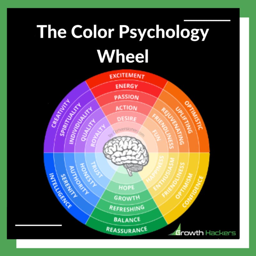
#9 Use the Right Color Scheme
In case you still don’t know, colors matter. Choosing the right colors is one common design principle you can apply to your website to increase conversion. What color scheme you use on your landing page affects the readers’ mood and emotions, and ultimately his or her perception of the page and the actions he or she takes. Different colors affect humans differently. For instance, the red color adds energy and stimulates. The blue color is relaxing and symbolizes peace, trust, and stability.
Hence, it is important that you select the most suitable color scheme for your product and business. If you can’t do it yourself, then it is a good idea to hire a professional designer who is well familiar with color theory and color psychology to help you. If you're looking for a great brand color palette generator, check this list.
Hence, it is important that you select the most suitable color scheme for your product and business. If you can’t do it yourself, then it is a good idea to hire a professional designer who is well familiar with color theory and color psychology to help you. If you're looking for a great brand color palette generator, check this list.

#10 Add Urgency
Urgency is an all-time marketing secret which simply works. It used to work, it works and it will always continue working. Why? The reason is that human psychology and nature do not change. Urgency is a powerful psychological tactic which stimulates people to buy from you now, not later.
In many cases, you lose potential customers because they postpone making a purchase. Yes, they like your product and they might want to buy it, but not now. For this reason, you want to use urgency triggers to make them buy now and not postpone making a purchase.
In many cases, you lose potential customers because they postpone making a purchase. Yes, they like your product and they might want to buy it, but not now. For this reason, you want to use urgency triggers to make them buy now and not postpone making a purchase.

#11 Add Scarcity
Using scarcity is another powerful tactic. Similarly to urgency, adding scarcity makes people want to buy from you now. First, the more scarce a product, the higher its perceived value in the eyes of customers is. Note that you can use scarcity marketing without leaving your customer feel manipulated.
Think of diamonds, for example. Why are diamonds so expensive? One of the main reasons is because there are not that many of them (well, at least on the open market). There is this theory that there are millions of them hidden in some dungeons but who knows. The current scarce supply of diamonds makes them really expensive.
Secondly, when people realize that your product is scarce and the number of available products/spots, etc. is limited and is running out, they understand that they must make a purchase now. Otherwise, they might be left with nothing later.
#12 Add Security Elements
One of the main reasons why businesses lose potential customers is lack of trust. To get people to take the desired action on your landing page you have to gain their trust. They want to be sure that it’s safe to hand over their money or personal information to you.
The best way to make them feel safe and secure is to link to a privacy policy page which guarantees the security of their personal information, as well as security seals which prove that buying from you is secure (Norton Secured, TRUSTe, trust badges, Stripe, Paypal, etc).
The best way to make them feel safe and secure is to link to a privacy policy page which guarantees the security of their personal information, as well as security seals which prove that buying from you is secure (Norton Secured, TRUSTe, trust badges, Stripe, Paypal, etc).
Final thoughts about these landing page design tips
Sales page vs landing page or splash page vs landing page vs homepage: what do you need? A lot of people, marketers and entrepreneurs get confused between landing pages, splash pages and sales pages. As the name suggest, a sales page is made to sell while a landing page should rather be focusing on lead generation while a splash page is used to be educational about a product, website or service.Landing page design does not have to be difficult if you know how to do it the right way. There are best practices but also things you should avoid when designing landing pages. You can refer to the most common landing page do's and don'ts if you aren't quite sure where to start. Some principles and tactics might change but consumer and human psychology never change. Knowing the most relevant and current tips and principles of landing page design will help you to build pages which convert. Today, we’ve given you the top 12 tips to make your landing page design this year as successful as possible. Good luck!
Growth Hackers is likely one of the best landing page agencies, we help businesses from all around the globe grow. Not only we help them design high-converting landing pages, we also help them with other digital marketing strategies, data analytics, conversion rate optimization and product development. Feel free to contact the Growth Hackers's team if you want to design outstanding landing pages, generate leads and increase your revenue.



1 Comment
Hi, I liked your article. I absolutely agree with every piece of advice. But what about testing? I think multivariate testing is a great way to find out all the details about a page’s performance. Using this type of testing, you can check how often visitors click a button, watch a video, or submit a form to leads … Plus, you can see how users got to your page and what device they used.